There are a variety of options for you in customizing your layers, depending on the attribute upon which you want to focus. Choose an attribute from the list (basically, one of the columns of census data in the shapefile’s data spreadsheet) and play around with how you want to visualize it! ArcGIS Online lets you customize most aspects of the visualization.
Hover over the layer you’re working with and click the Change Style button (feel free to make a copy first if you want to play around with a couple of different viewing options).
Choose an attribute to show from the dropdown, then select a drawing style underneath (different options appear depending on whether the attribute is numeric or textual/categorical). You can also scroll down to the bottom and choose New expression to write a script that creates a custom expression combining attributes in some way.
For example, with the census data, you could combine the numbers of children of different genders and age groupings to get the total number of household members aged 17 and under, with a custom expression along the lines of $feature.Fem5to17 + $feature.FemUn5 + $feature.MaleUn5 + $feature.Male5to17.
Textual/Categorical Data (jobs, race, schooling, heritage…)
- Types (Unique symbols), which shows different categories as different colors
- Location (Single symbol), which simply shows the location of your data (as a point or as a polygon)
Numeric Data (acreage, ages, number of people in a household)
- Counts and Amounts (Size), which uses symbol size to represent your numeric data
- Counts and Amounts (Color), which uses a color scheme to represent your numeric data
- Location (Single symbol), which simply shows the location of your data (as a point or as a polygon)
- Types (Unique symbols), which shows different categories as different colors
- and for points data, Heat Map, which shows areas of high activity in colors that appear “hotter”
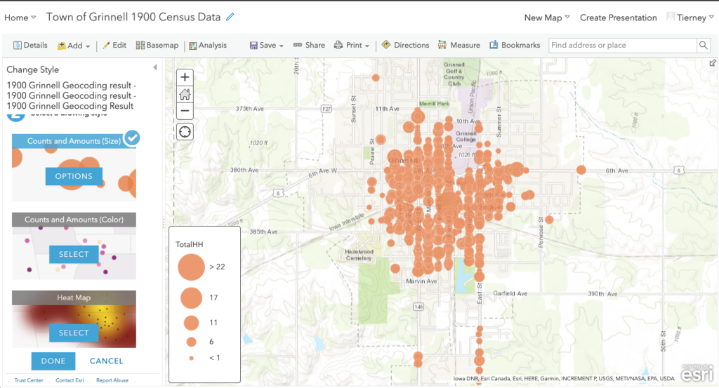
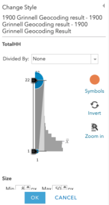
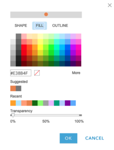
Click the Options button at the center of the selected drawing style to customize the visualization on your map.
Each of the options outlined can be customized – both the visual aspects (like size, color, symbol, transparency) and some of the numeric aspects (such as data classification and breakpoints).
Reflection Questions
- What do you notice about your visualization as you change its drawing style, customize its appearance, and customize your basemap?
- In the case of numeric data, spend some time playing around with breakpoints using the Classify Data options – try out different types of breaks, and different numbers of classes. What makes sense for the attribute you’ve chosen?
- What is gained and what is lost with different visualization options?
Once you’re finished customizing, make sure to click the blue Done button at the bottom of the viewing pane to make sure your changes are saved.